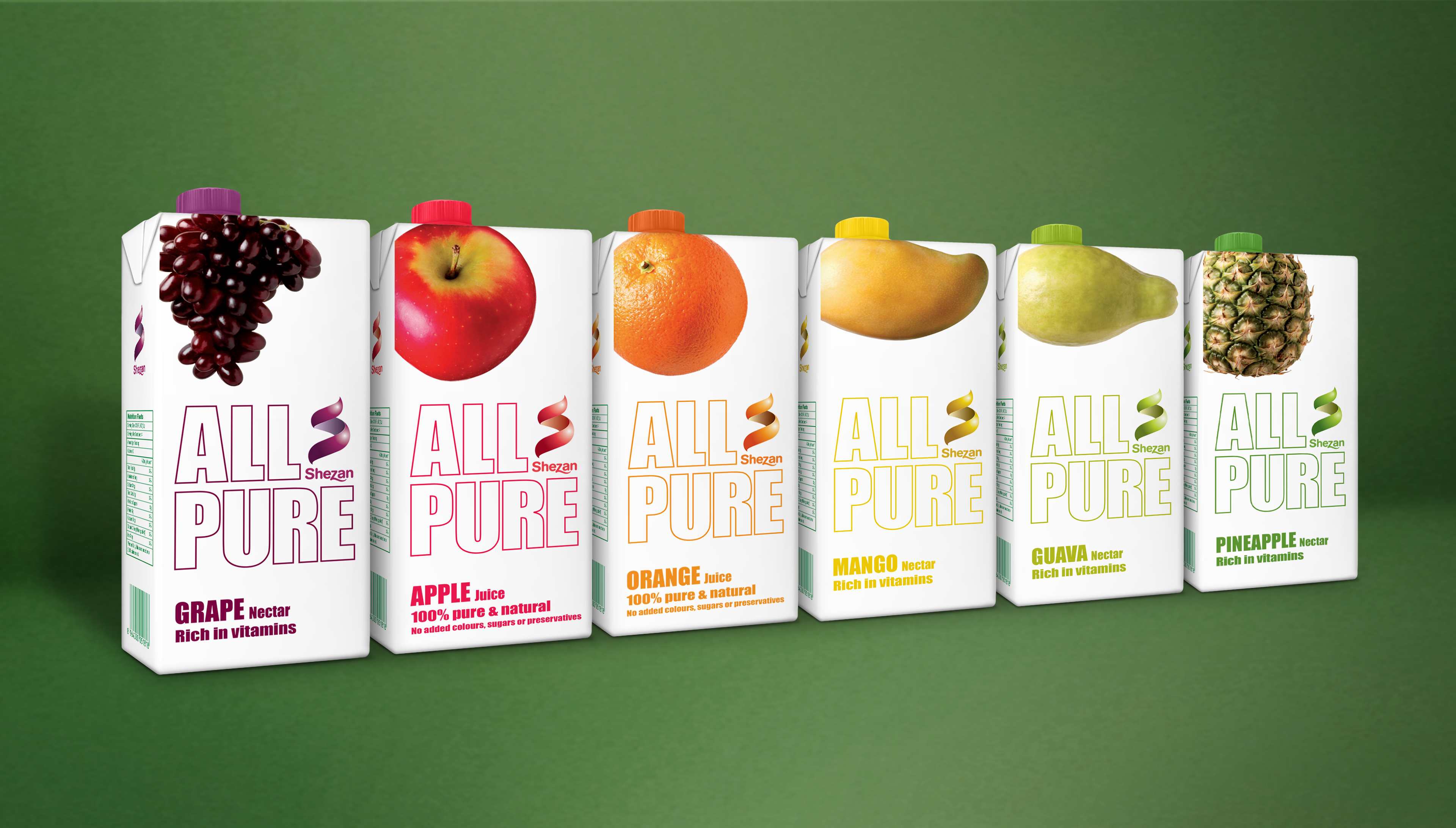
Shezan produce food and drinks in Pakistan, made from fresh fruits and vegetables grown in their own orchards. They wanted to take their existing All Pure juice into Europe and needed their branding and packaging redesigned to suit the new audience. The original cartons were cluttered and busy, with a very synthetic quality to their appearance. It therefore seemed only natural for my team and I to strip them back until they more accurately reflected the product offering: pure and simple, with no added ingredients, letting customers drink straight from the fruit.
I also simplified their logo and added a friendly brandmark in the shape of an 'S', a playful take on the idea of fresh peelings.
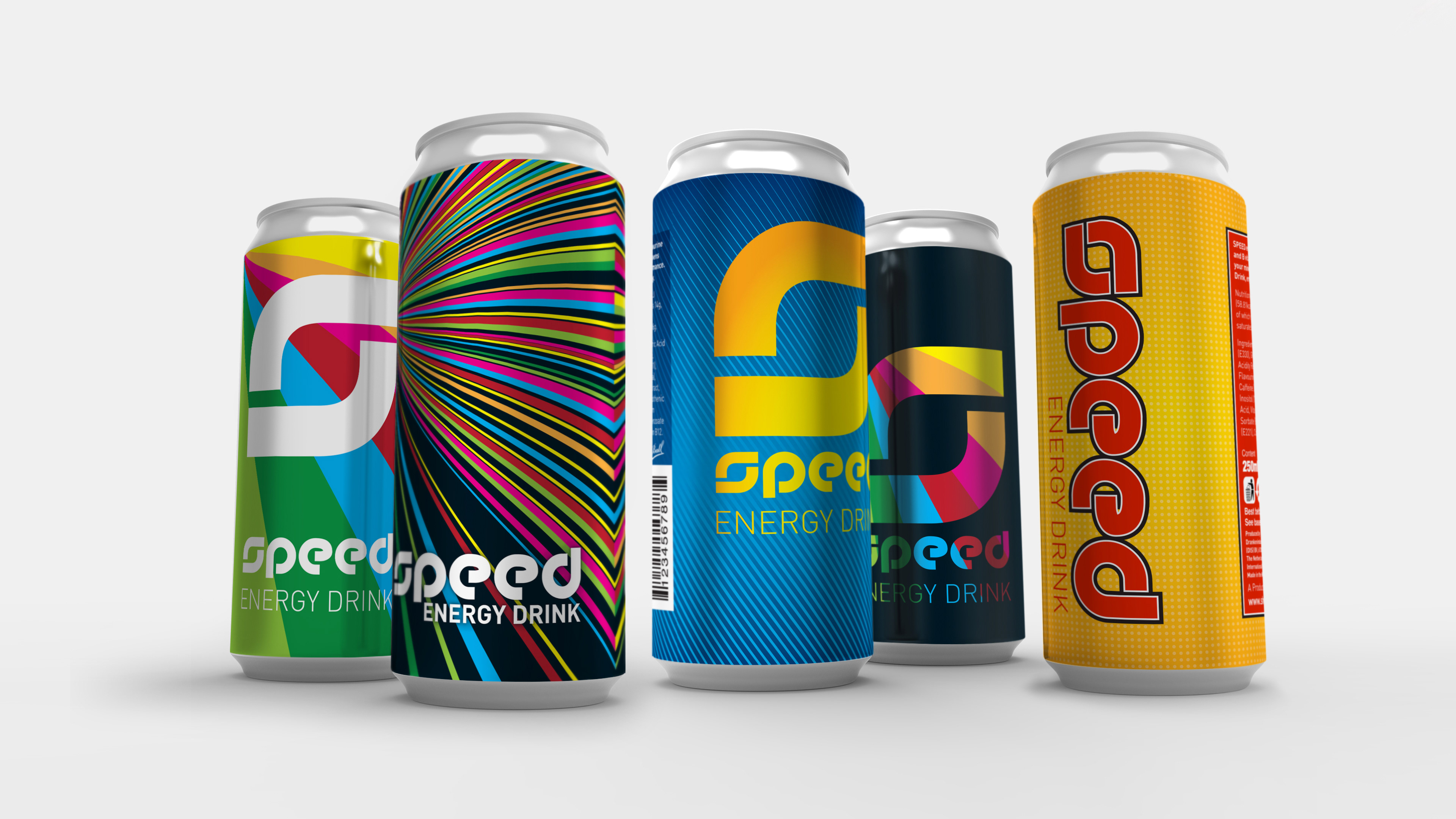
Shezan’s Speed is the Red Bull of Pakistan. A few years ago they asked us to come up with a selection of designs for a new batch of cans. The Shezan board liked the black one, second in from the left, and, after some back and forth with the printer about colours, formats and tolerances, I’m told it’s now found all over the country.
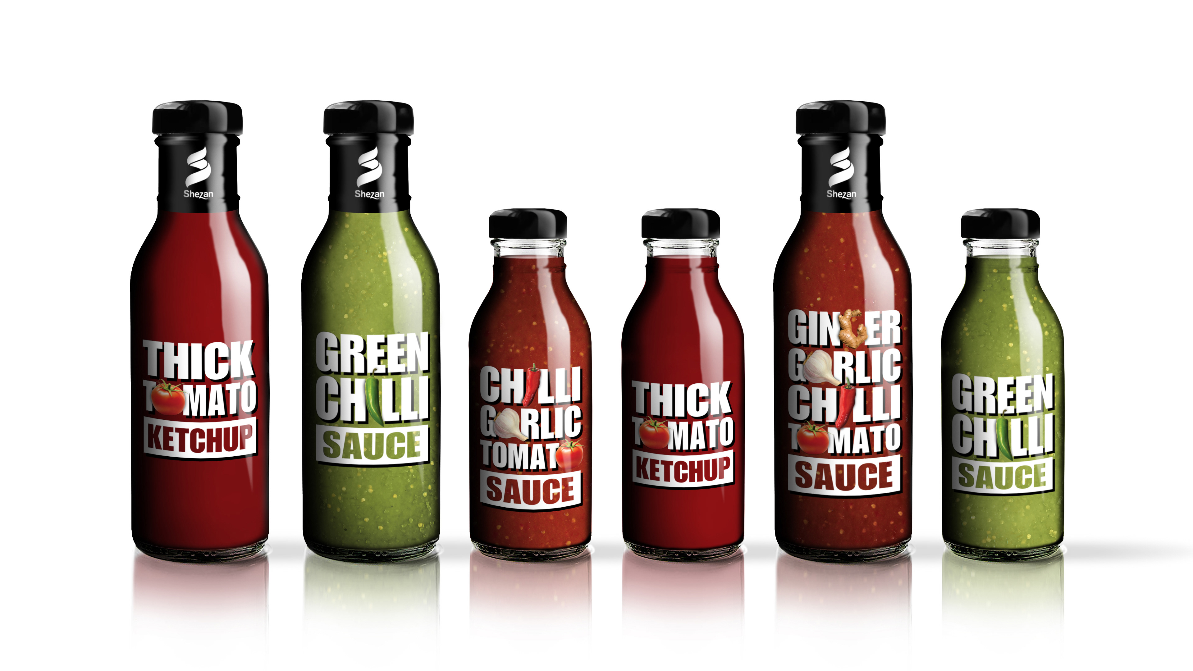
Following on from the success of the All Pure work, Shezan asked me to redesign the packaging for their sauces and ketchups. It was an opportunity to pursue the same intellectual arena as the earlier work and pare everything back to an elegant expression of the simplest possible message. The design proposal used the product name with cunningly placed pictures of the ingredients, and as few other distractions as possible.
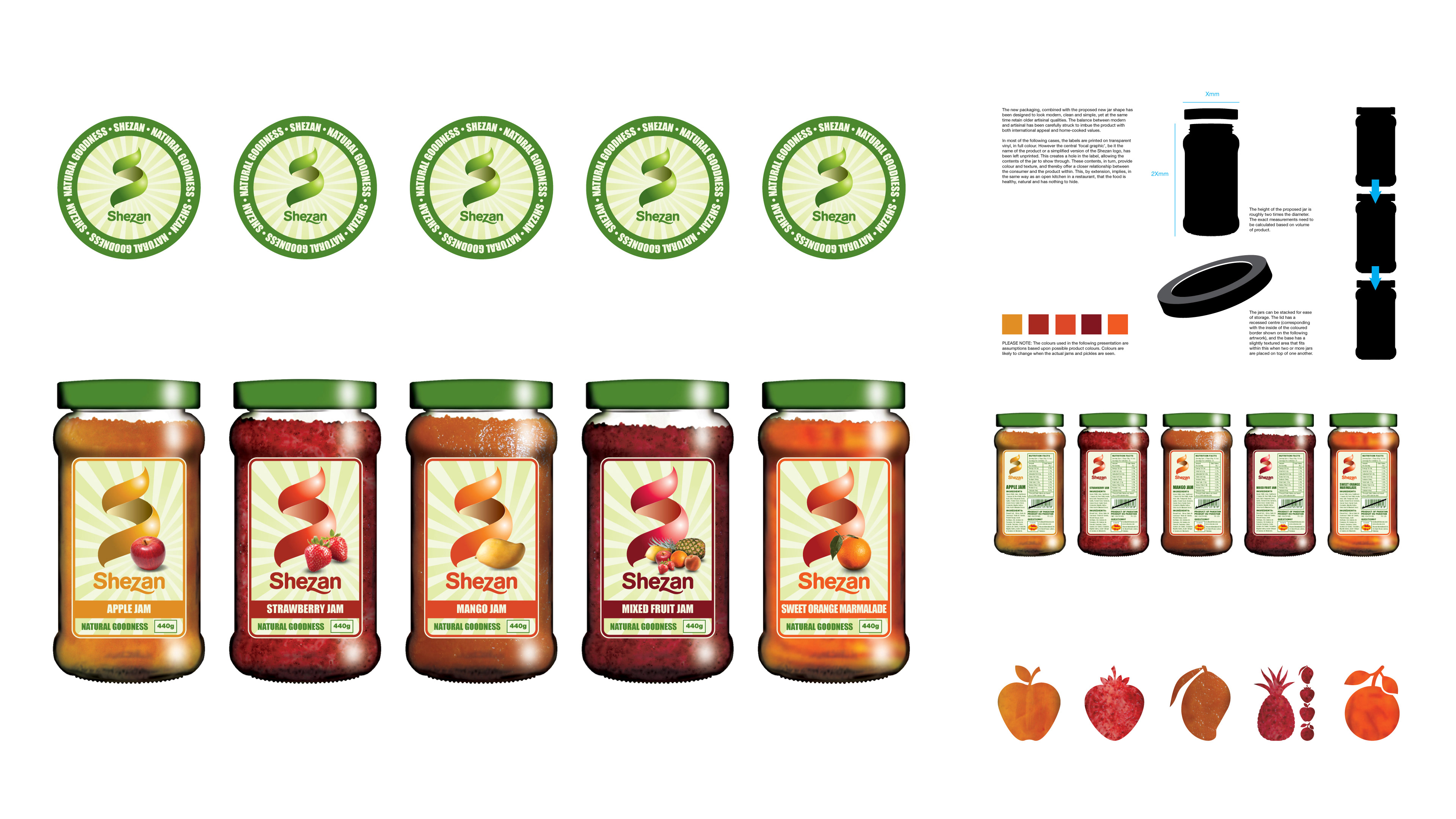
Shezan also asked that their range of jams and conserves were looked at. They wanted a wholesome approach, as if the spread was made by your gran from fruit in her garden. They also asked for a large logo on the front of each jar. I was more intrigued by the idea of the relevant fruit shape, die-cut from the label to display the actual jam behind – something that I felt was closer to the 'purity' concept of their juice and sauce ranges. Thus my initial explorations, some of which are shown above, looked at both routes.