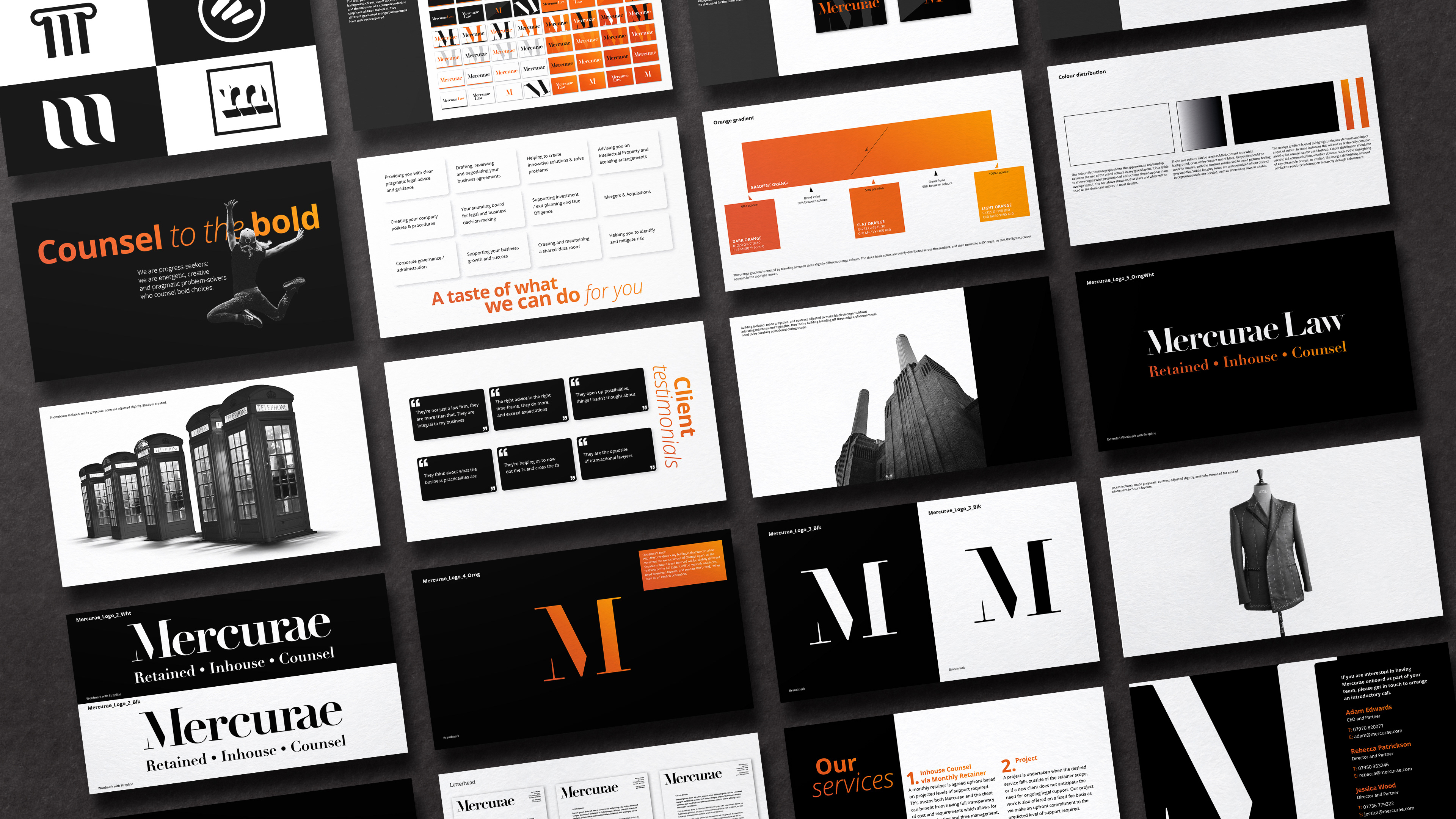
The three partners at Mercurae approached me to develop a brand identity for them, working alongside a strategist who had been looking closely at their needs. Their unique business model, where they are retained by their clients, means that they are always on hand to offer smart legal advice without huge fees being incurred. I liked the idea that this made them a kind of invisible, in-house wing of any firm that they worked with. Taking that concept as inspiration for their wordmark, I hid key elements of certain letters in a way that tightened the kerning, reduced negative space, yet never compromised legibility.

Over the course of a few weeks we all worked closely together to get a design that everyone was invested in and felt proud to be a part of. The process was brought to bear by always presenting a handful of options at key stages, especially early on, to ensure views were aired and tastes were met.
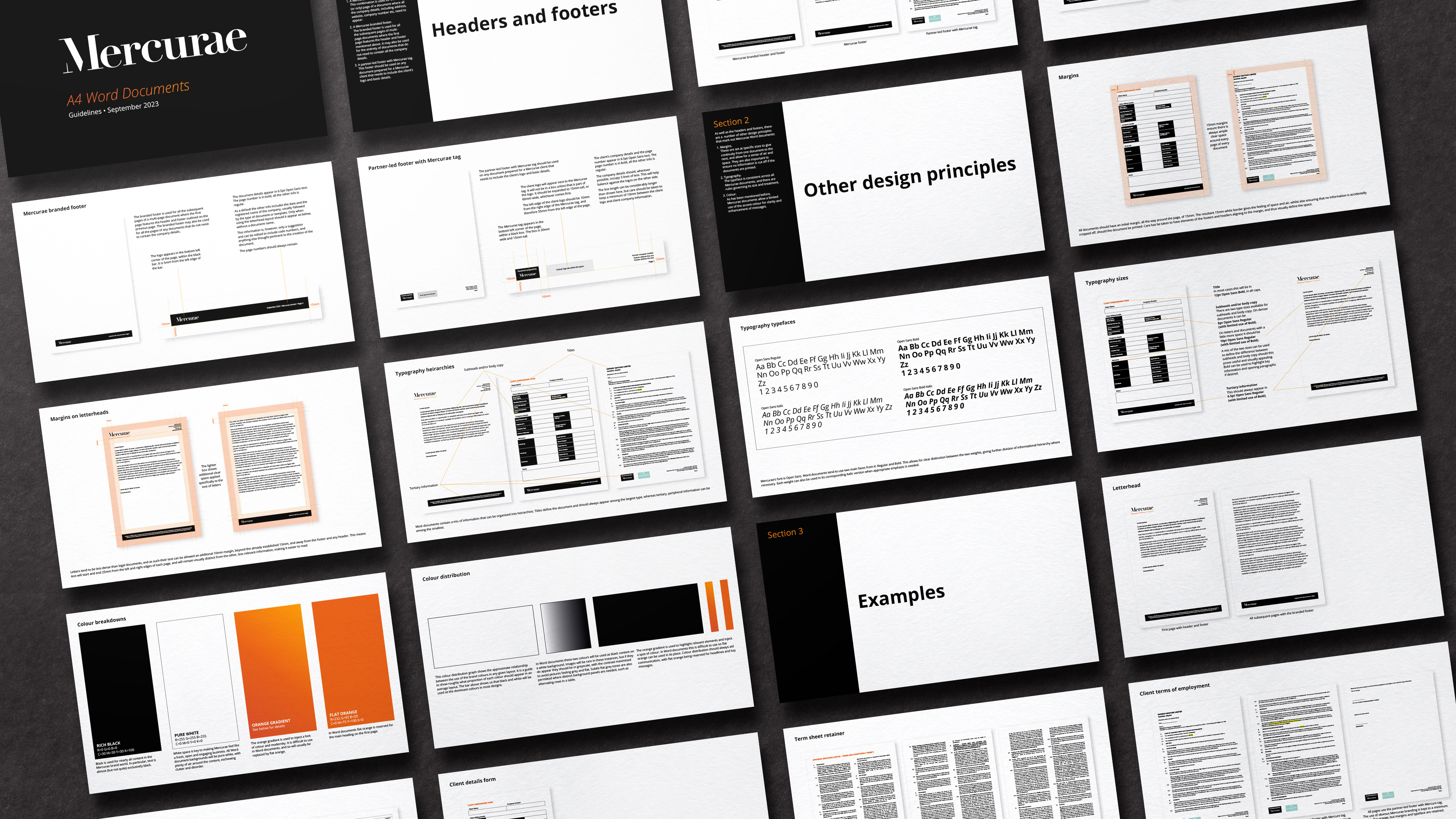
The needs of the project evolved and in the end I delivered them a logo and social media icon, alongside stationery and a suite of Photoshopped images, plus a selection of the Word documents that formed their day to day business, and a book of guidelines detailing how to go about creating new ones.