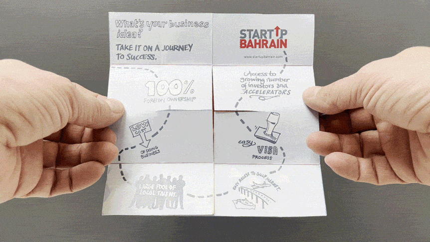
The Government of Bahrain, and their Economic Development Board, was a major client while I was working as Head of Design at M&C Saatchi Export. But my team and I were never able to redesign the brand. Instead we were tasked with small adjustments on a project by project basis. This feedback often came from more than one department within the government offices, and could sometimes appear quite contradictory. One of the most challenging tasks was to make the work feel modern and global, while at the same time traditionally Bahraini.
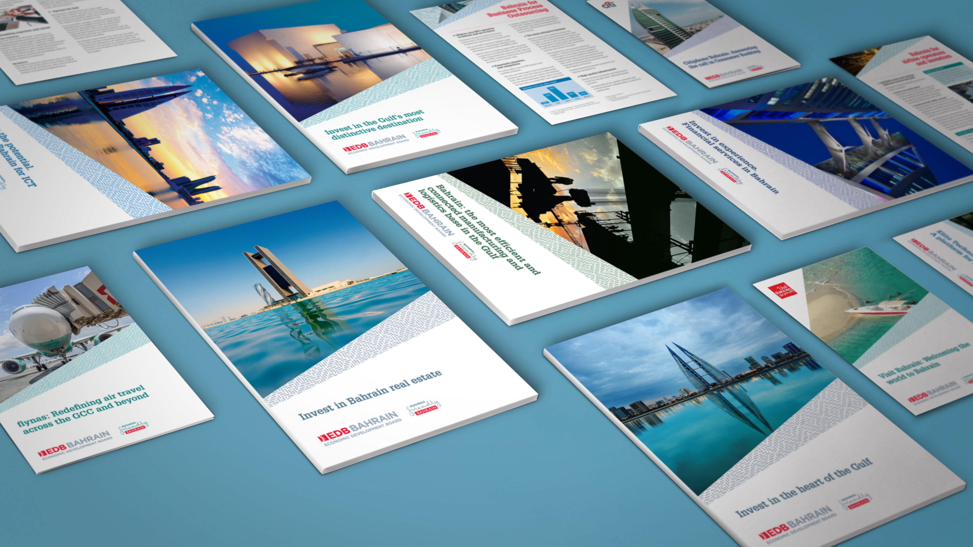
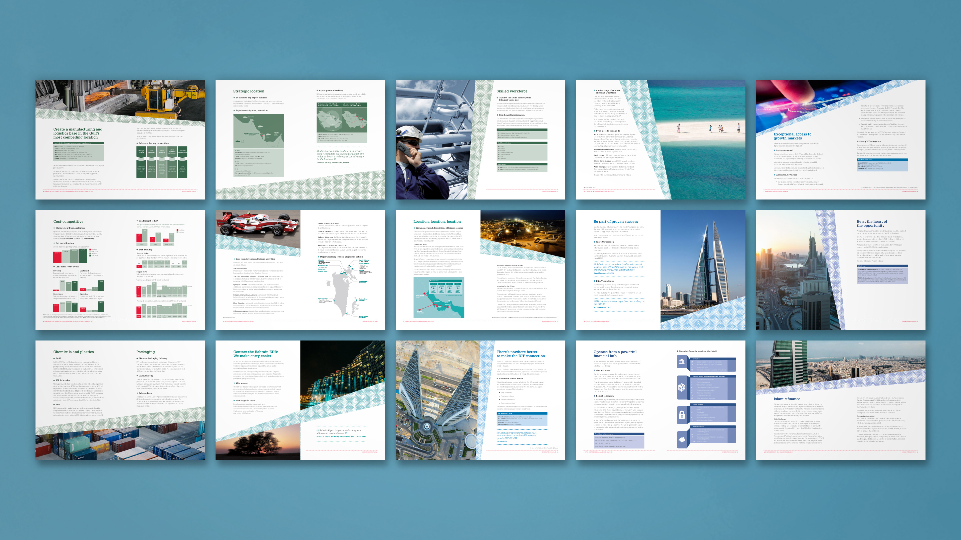
The solution we found involved a representative on the ground in Bahrain. He was sent to the 19th century houses of the Muharraq region, where he found ornate wooden patterns carved into screens. We chose a pattern and came up with some tweaked colour schemes, which would compliment the client’s bright red accent colour, and could be used to represent their various different departments.
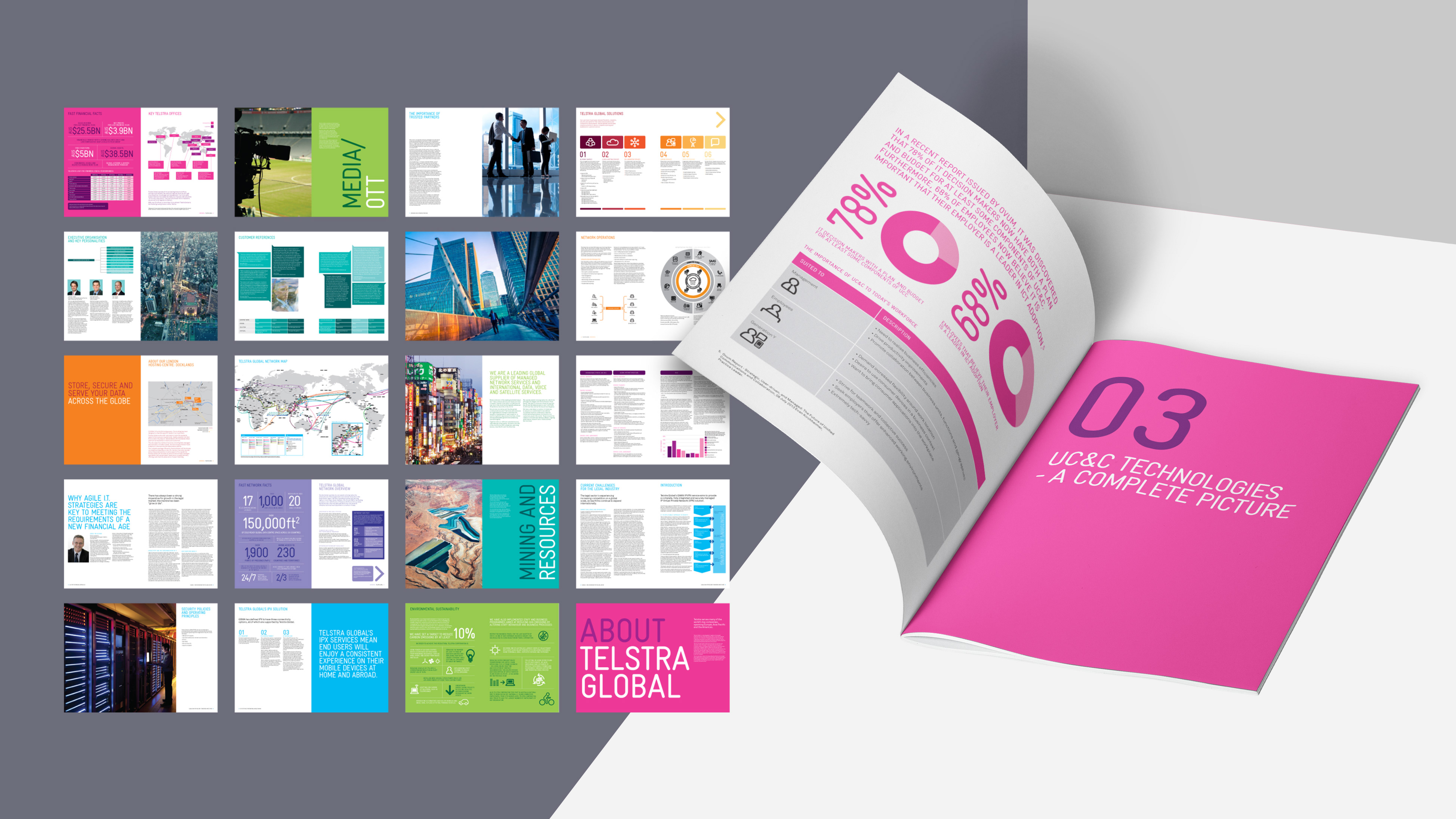
The added colour and texture was generally liked, so my team and I began the work of producing all the printed collateral. By the time we had finished we had created a suite of about 20 brochures, booklets and leaflets.
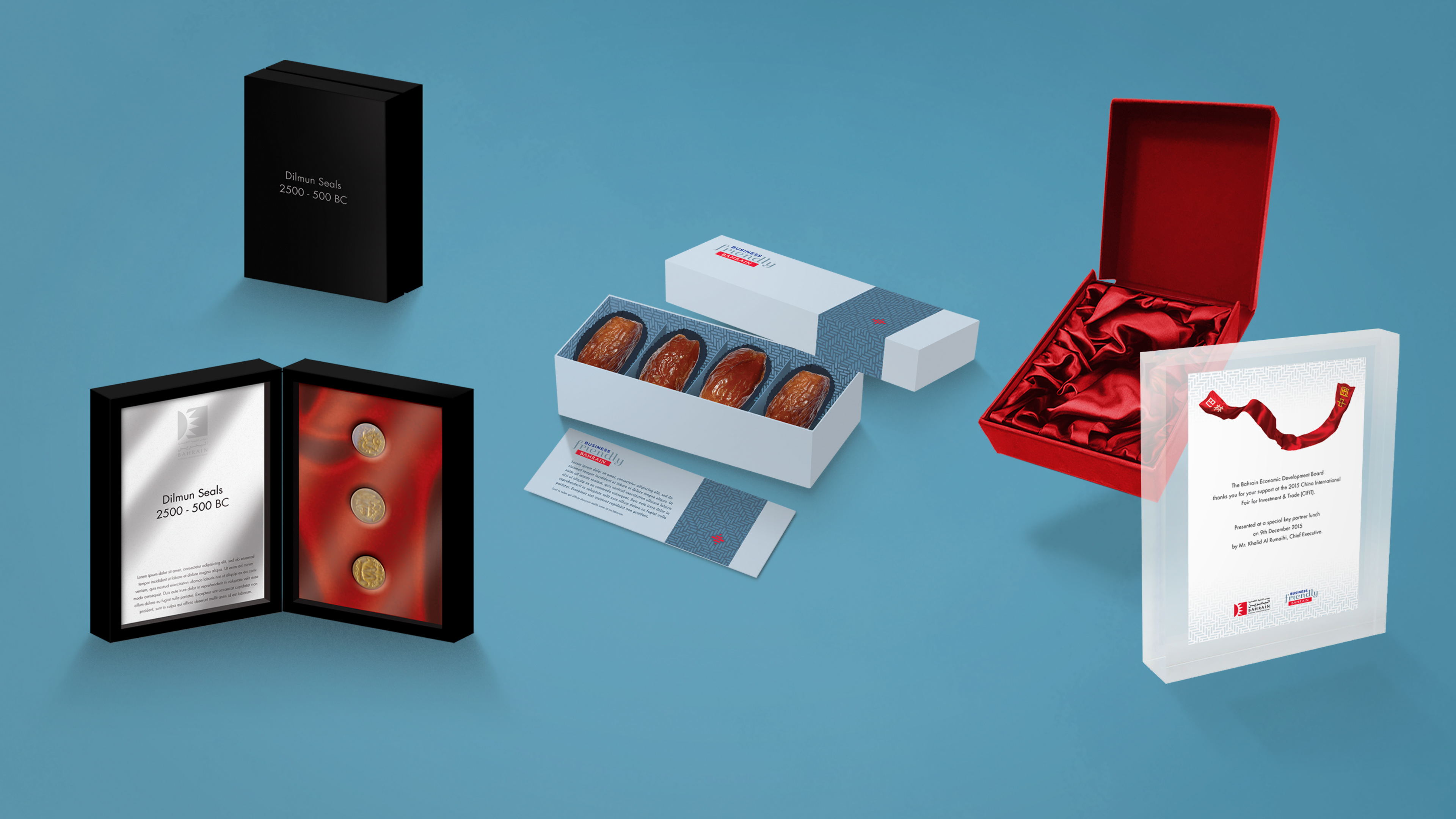
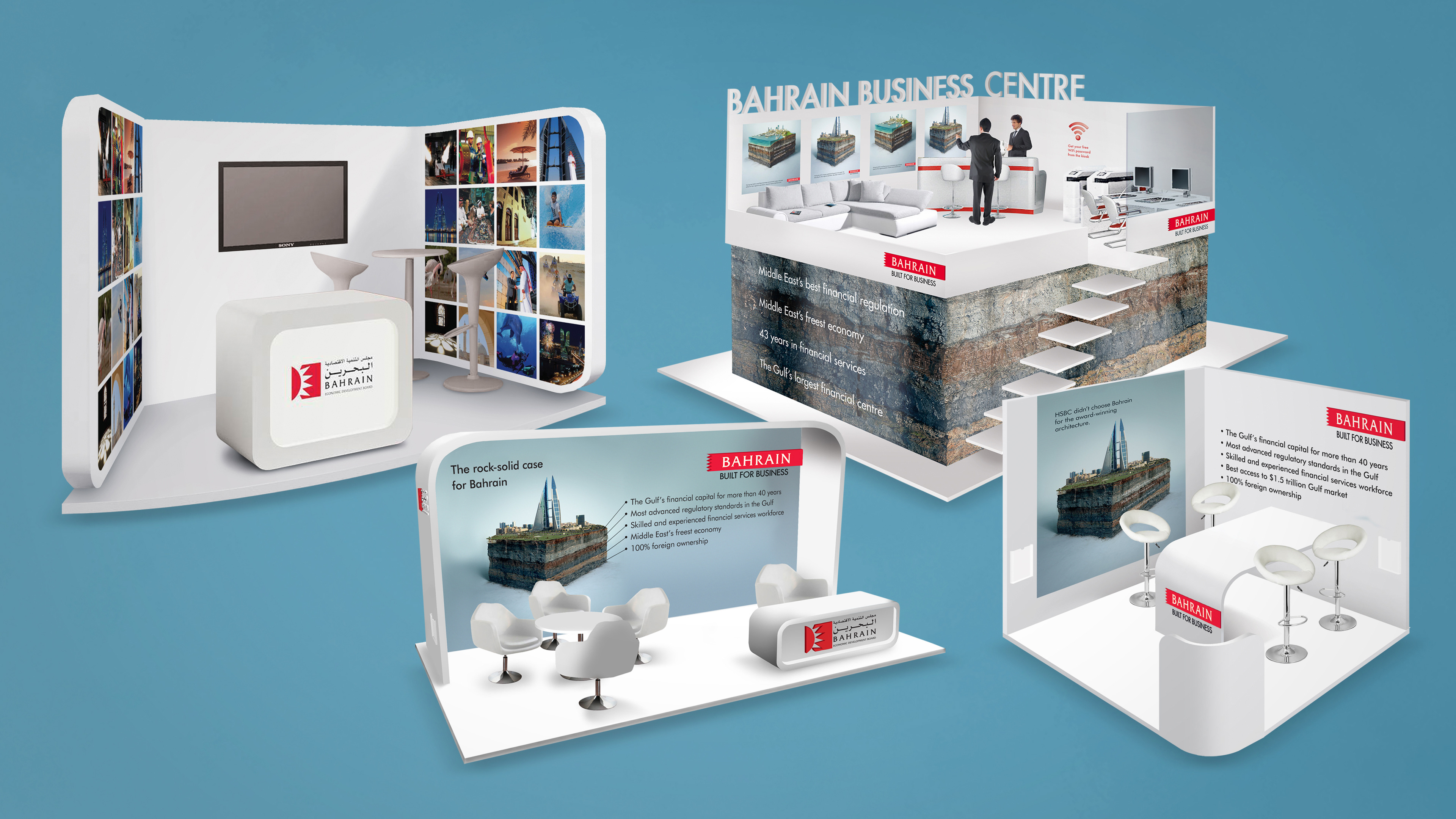
Yet the work wasn't just limited to print. There was a huge variation in the items we designed, from gifts for dignitaries to awards certificates, to event stands both large and small.
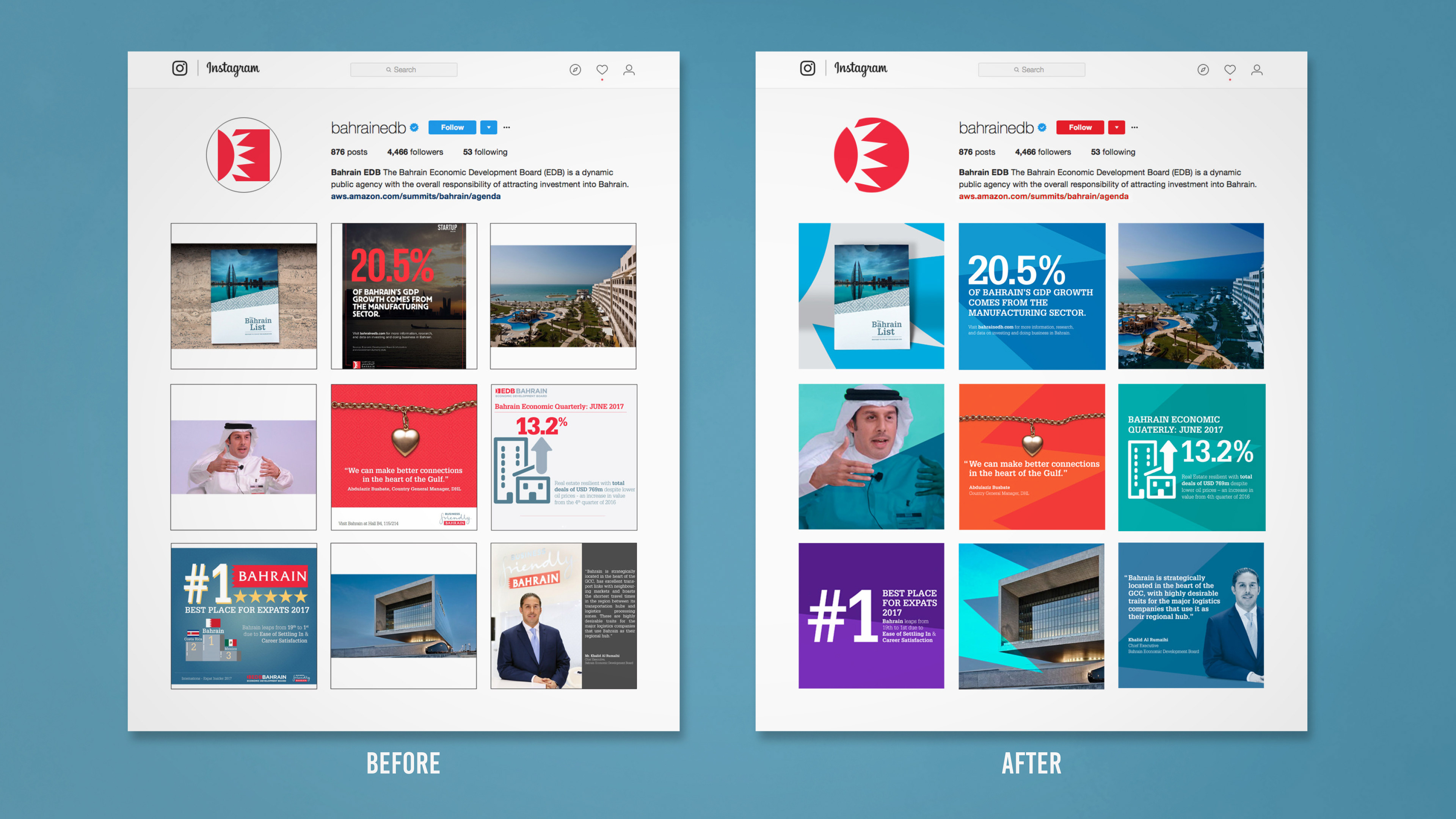
My team and I were even tasked with re-invigorating the look of the Economic Development Board's social media channels. We started by collating and categorising the kind of posts commonly put out, then explored various different ways of imbuing them with a common visual thread.
We looked into optimal shapes for cross-compatibility between platforms and took into account their various safety areas at the time.
We removed any unnecessary material, such as overly long explanations and redundant logos, applied a consistent type style, and added a fresh and bespoke background or overlay, based upon the client’s logo, all with an eye towards the most simple and dynamic layouts.
The project was so successful that the client later asked to adopt the design style across all their marketing comms, and there was even talk of creating an app that could ‘Bahrainify’ your images.
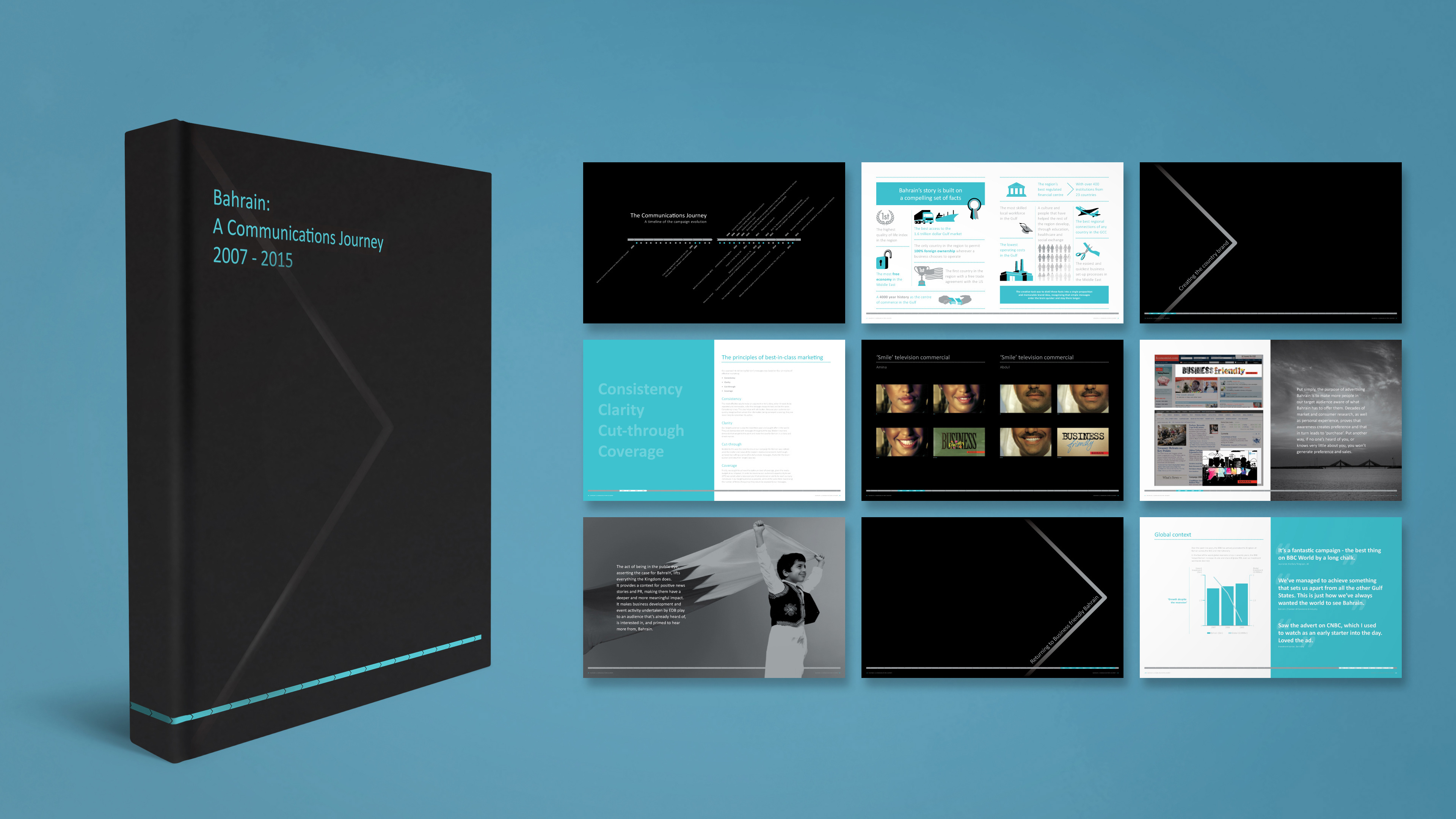
Over the course of roughly a decade The M&C Saatchi team had created a huge body of work for Bahrain, from press and TV ads to posters, brochures, websites and all sorts of marketing collateral.
It was decided to showcase the various campaigns in a deluxe, hardback coffee table book that, as well as being a guide, would be a lavish point of attraction in its own right. I devised a timeline motif to act as a navigation bar to the nearest quarter of a year, which would set the design theme throughout the book. The bar's negative space then morphed to become the chapter headers.
The book had Pantone endsheets, a metallic Pantone duotone system on key image pages, and subtle spot varnish on the matt black cover.
"Tod is a highly skilled and versatile designer... (and a) strong team leader and nurturing people manager. He is a pleasure to work with both professionally and personally."
JESS WARDLE
CEO, M&C SAATCHI EXPORT
See the full quote
CEO, M&C SAATCHI EXPORT
See the full quote